User Interface Guide
Welcome to ReactorCX. We hope that this tool enables your organization to deliver a world-class customer experience and enable true customer-centric innovation.
Intended Audience
This guide is suitable for anyone who is going to use the ReactorCX User Interface to define programs, manage members, manage system settings, and viewing analytics reports.
Basic User Interface Navigation
ReactorCX is a web application which runs in your browser. Below is a description of the general user interface elements and navigation paths used throughout the application.
General Layout
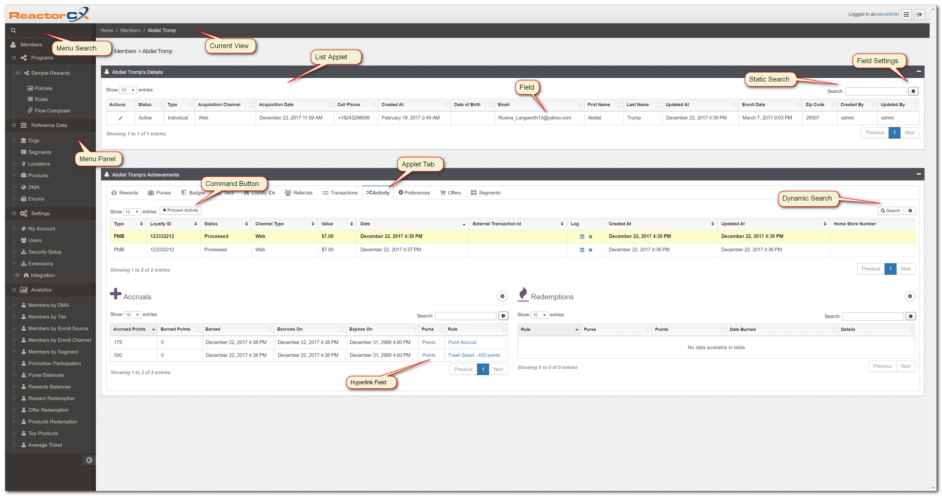
Figure 1. General Layout
Below is a basic description of the different elements commonly found on the ReactorCX User Interface:
| Element | Description |
|---|---|
| Menu Panel | This is a list of options to select and navigate to different views within the system. |
| Menu Search | You can type in text to search the menu options and filter them. |
| Current View | The current view is the right-hand side panel that's displayed when you click menu options. |
| List Applet | The list applet is a portion of the current view that displays lists of different objects like Members, Purses, Tiers, and others. |
| Static Search | Some list views have a static search which filters the data immediately as you enter text. |
| Dynamic Search | For large data sets, the dynamic search allows specifying field criteria and searching. |
| Applet Tab | An applet may have one or more tabs, which alternate what lists are shown in the content of the applet. |
| Command Button | A command button is used to perform some action relevant to the applet it's close to or the view it's displayed in. For example, Process Activity allows manually processing an activity. |
| Field Settings | The Field settings button allows you to configure what fields you want to see on an applet. |
| Current Record | The current record highlights in a different color and allows showing additional detail for a record when it becomes current. |
| Hyperlink Field | A field in a List Applet with text colored in blue. This is a Hyperlink that takes you to another view when clicked. |
Dialog Boxes
Dialog boxes allow entry of new information. Below is an example screenshot of a Dialog Box and it's main components:
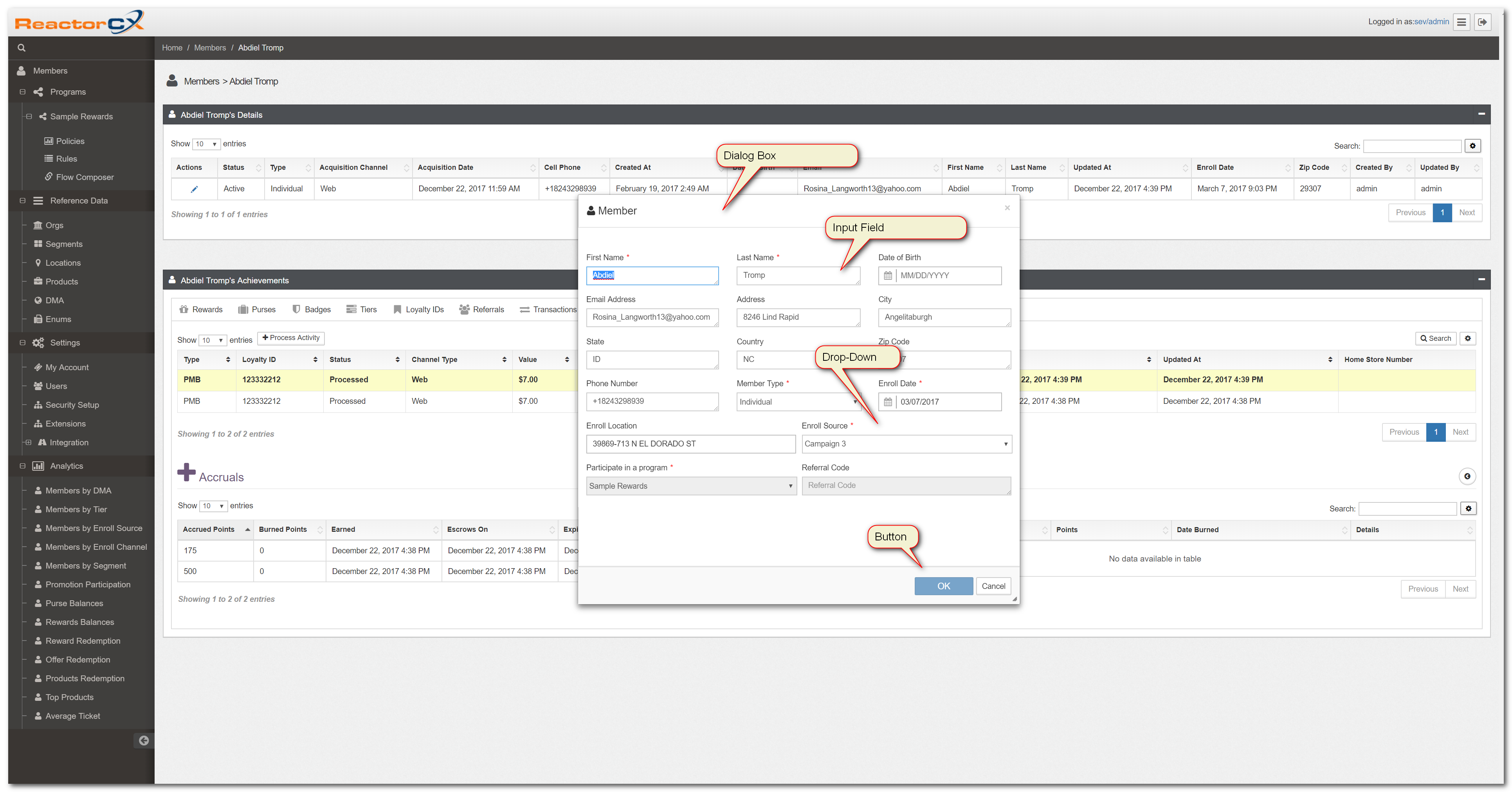
Figure 2. Dialog Boxes
| Element | Description |
|---|---|
| Dialog Box | A window that allows information entry for specific purposes. |
| Button | Ok/Cancel are typical options when entering information. These are also referred to buttons. |
| Checkbox | A toggle control that allows you to specify yes/no attributes. |
| Dropdown | This is a list of options that can be populated in a field on a dialog box. |
| Input Field | Input fields allow you to enter information such as FirstName, LastName, and others. |
Record Action Buttons
In typical list views, you notice Record Action, which allow you to edit (pencil) or delete (x) a specific record. In a lot of views, clicking on the record allows you to edit it as if you had used the edit record action button.

Figure 3. Record Action Buttons
The following buttons are available in List Applets, subject to permissions granted to a user:
| Icon | Button | Description |
|---|---|---|
 |
Edit | Brings up an edit dialog box to allow changing the values in the record. |
 |
Delete | Deletes the current record after confirmation prompt. |
Note
Adding new records is done using Add, which is located above the List Applet in the top right corner.
Working on Multiple Records
You can select multiple records to edit or delete. To do that, use the record selector checkboxes on the left-hand side in any list view where multi-edit makes sense:
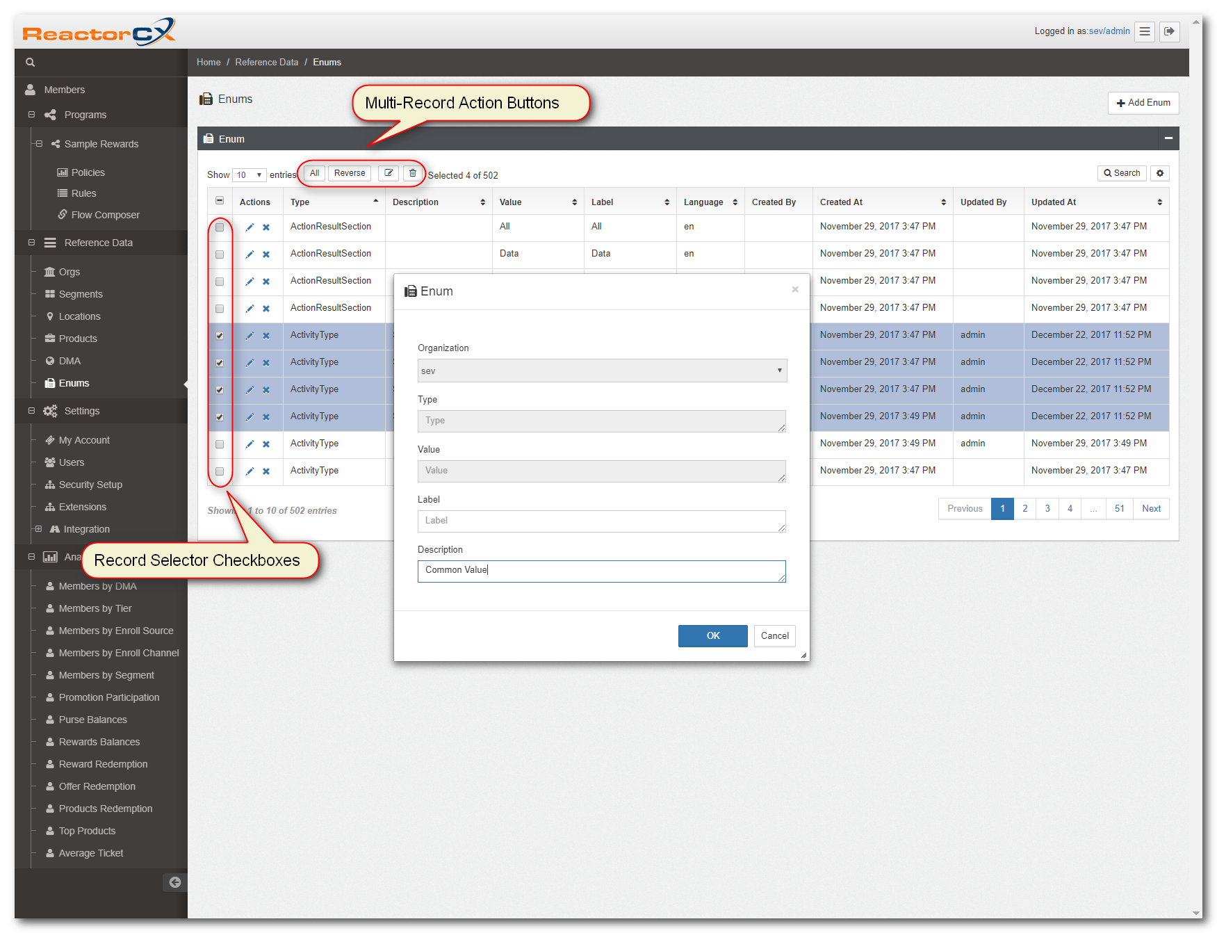
Figure 4. Multi-Record Operations
The following table describes the purpose and function of each button in the Multi-Record Action Button section shown in Figure 5:
| Icon | Button | Description |
|---|---|---|
 |
Edit Selected Records | Brings up a dialog box that allows you to change fields on the selected records. |
 |
Delete Selected Records | Brings up a dialog box that allows you to delete the selected records. |
 |
Select All Records | Selects all records in the list view. |
 |
Reverses the Selection | Reverses the selection in the list view. |
Note
To deselect all records, press All, then Reverse.
Warning
When you select All records, this selection applies to all records in the current view, not just the ones you can see on the screen.
Record Search
To find records within a list view, use the Dynamic Search button as shown in General Layout.
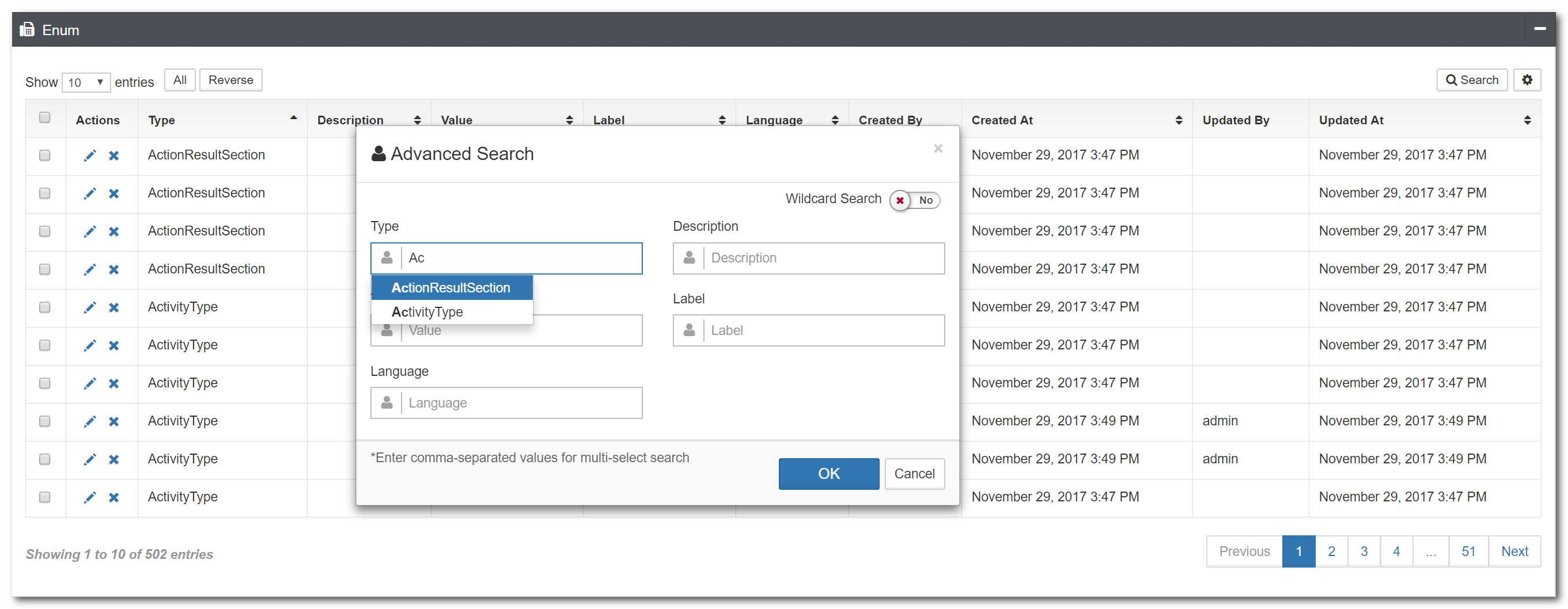
Figure 5. Search Dialog Box
The search dialogue box is a field for a query input or a search term from the user to search and retrieve related information from the database. It's present in all the screens with a list view in RCX.
Advanced Search Features
Below is the list of advanced search features:
1. Autocomplete search
Type partial values in the search fields, then press F8 to find if the database contains any matches and use the autocomplete to populate the search string.
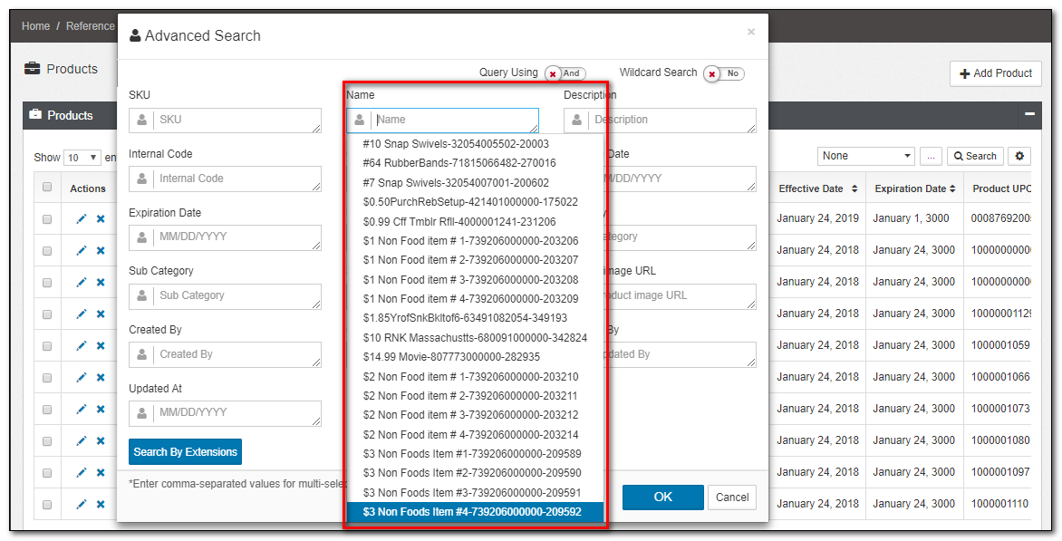
Figure 6. Autocomplete Search
2. Wildcard Search
Wildcard searches aren't simple exact string matches. They're based on character pattern matching between the characters specified in the search box query and words in the database that contain those character patterns.
You can turn "Wildcard Search" on to enable entering regular expressions in the search criteria as shown in Figure 8
Example
^[0-9]+finds anything beginning with one or more numbers.[0-9]+$matches anything ending with one or more numbers.^Abcmatches anything that begins with the lettersAbc.Abc$matches anything ending with the lettersAbc.
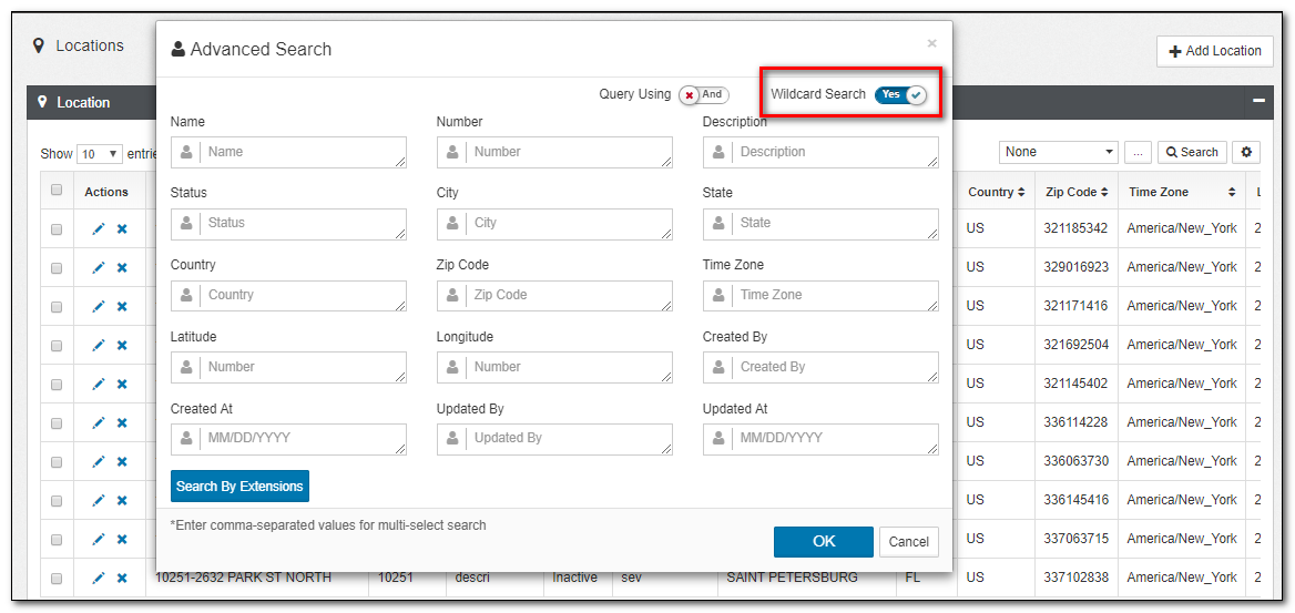
Figure 7. Wildcard Search
Searching and Filtering Reference Data
For searching and filtering the Locations data, follow the steps as noted below :
Searching
1.Navigate to Reference Data>Locations.
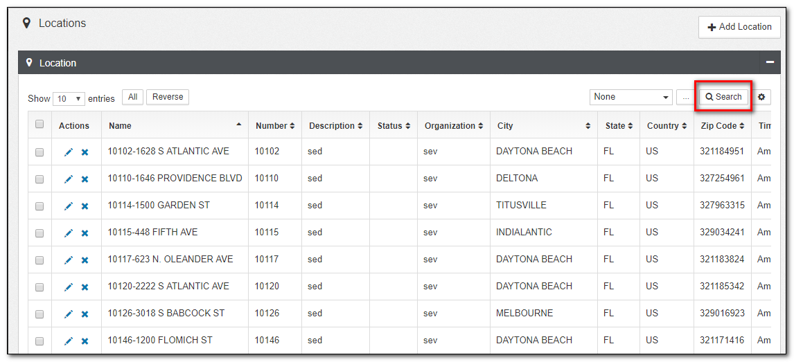
*Figure 1. Locations Window
2.Click the Search button provided in the top-right corner of the Locations window. A new dialog box appears as shown below:
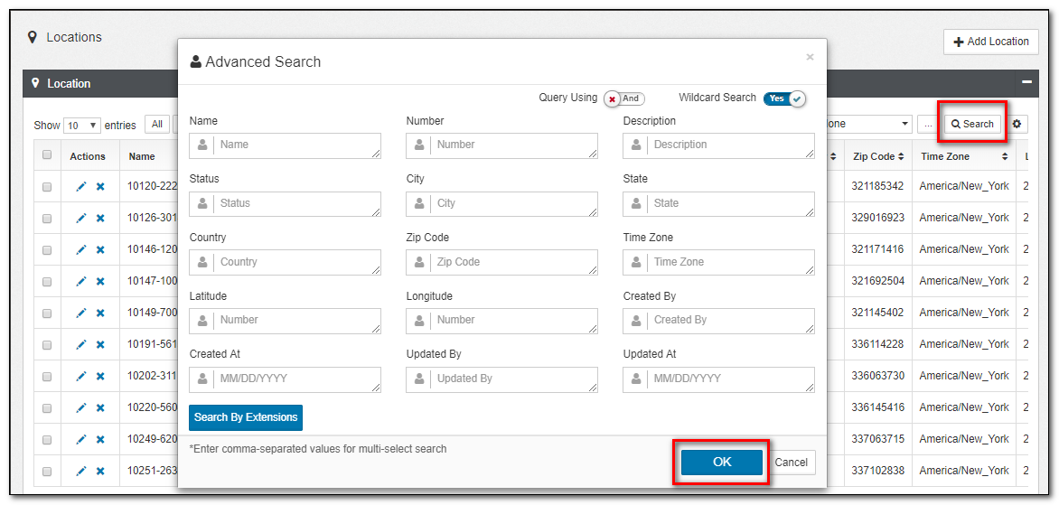
Figure 8. Locations Advanced Search
3.Enter a search string or combination of characters that are required. The search string could be the data in any of the attributes in Locations reference data. These are the most common attributes used to search:
- Name
- Number
- Description
- City, State, Country
- Zip Code
- Time Zone, and others.
Note
Comma-separated values, searches multiple records at once.
4.Click OK or Cancel to confirm or discard your changes.
Filtering
A user could also filter the data by performing a right-click a field in the list view and filter records either containing that field value or excluding the selected field value.
1.Right-click any field column of the underlying table and click the + (include) or the - (exclude) button for adding or removing the data related to particular search criteria as shown in Figure 1 below :
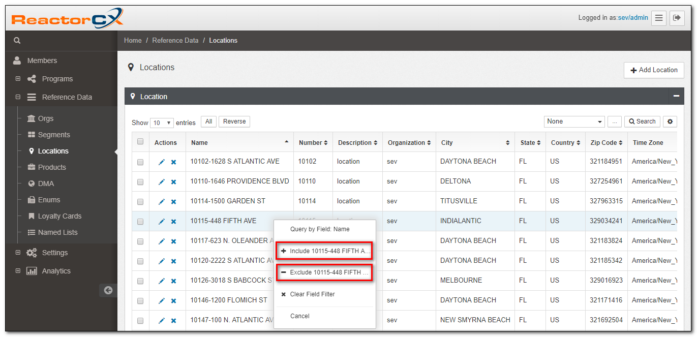
Figure 9. Field Filter
2.The included attribute displays as Blue in the products list view.
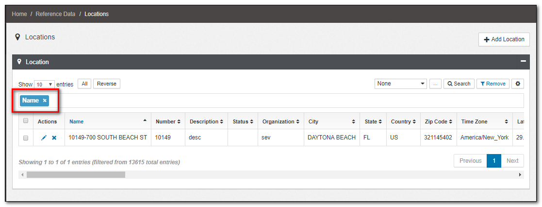
Figure 10. Field Filter
3.The excluded attribute displays as Red in the products list view. Only one action is performed at once on one record.
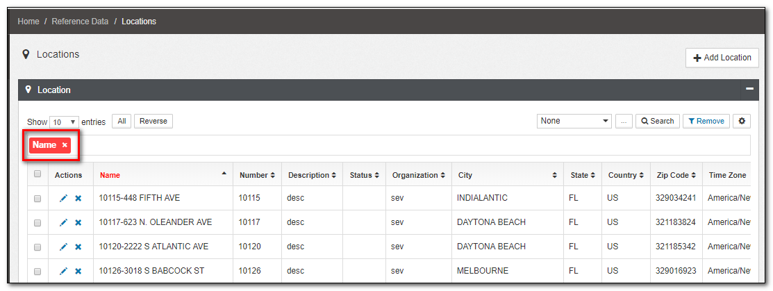
Figure 11. Field Filter
Filtering Multiple Records from Advanced Search
A user could filter multiple records of data with comma-separated values inside a single attribute. Now, these records found other had from the comma-separated values can be either included or excluded.
The include and exclude options can also be combined to select an attribute with comma-separated value to be included and another attribute with comma-separated value to be excluded.
1.Right-click a field attribute and click the + (include) button and type the required data by comma-separated values or press the function key F8, which helps to look up the matching data based on the search string from the database, then click another field attribute and the - (exclude) button and type the required data by comma-separated values.
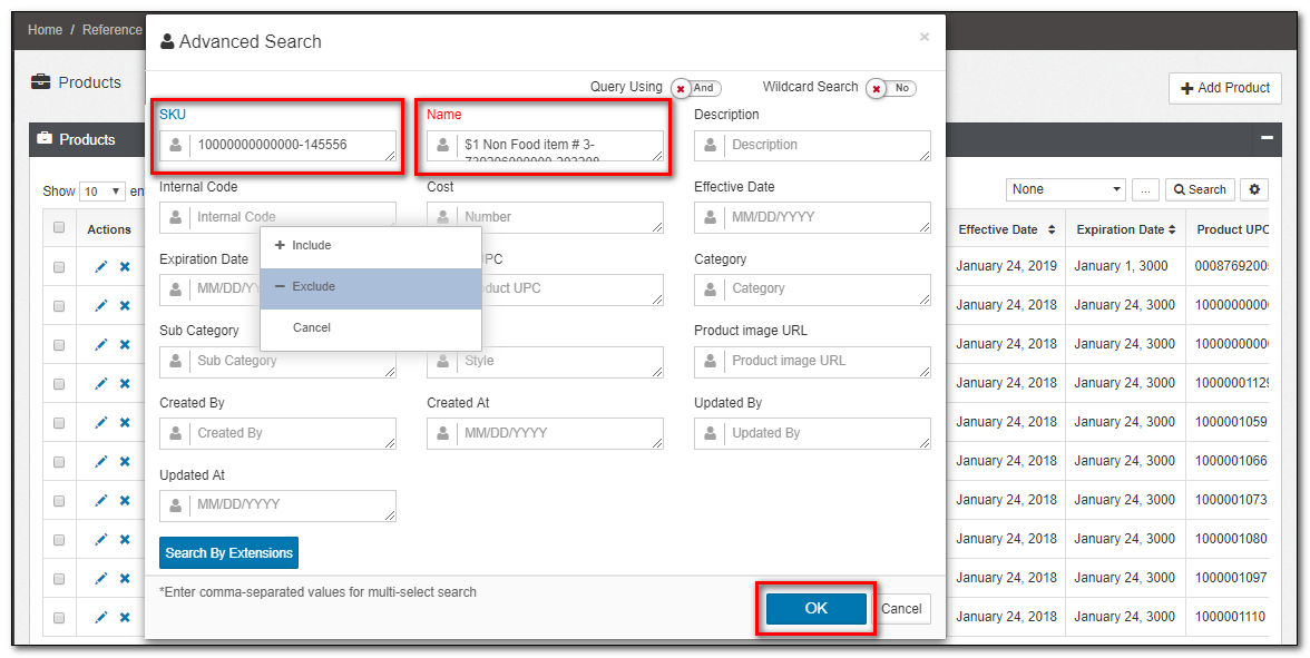
Figure 12. Advanced Search Filter
2.If you select the data to exclude, the input field name changes to Red, And If you choose the data to include, the input field name changes to Blue.
3.Click OK/Cancel to Confirm or discard the changes.
4.The included attribute displays as Blue, And the excluded attribute displays as Red in the products list view.
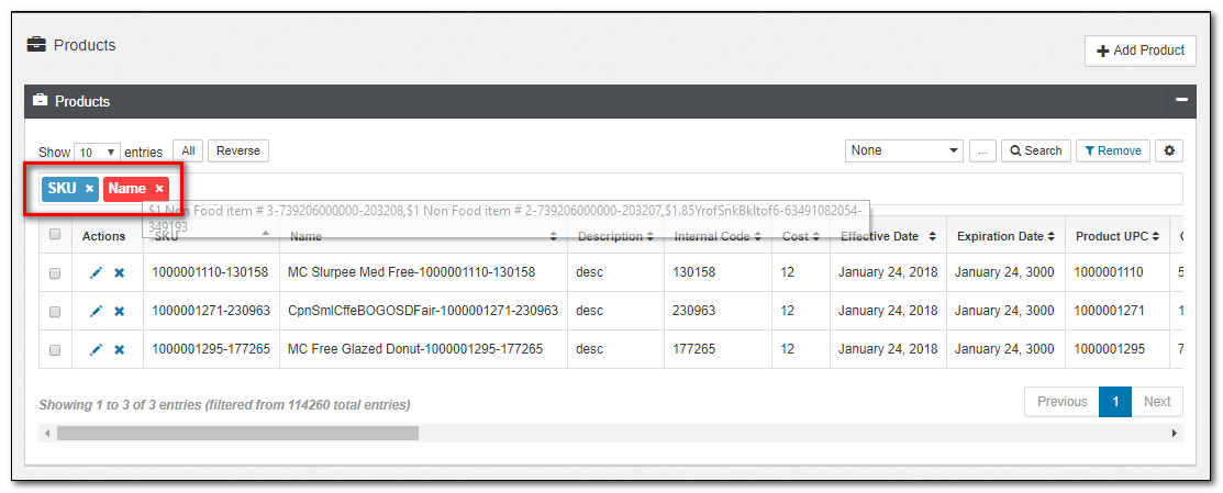
Figure 13. Multiple Filter
Searching and Filtering with AND/OR query
A more complex level of searching and filtering can be performed using the query options AND and OR.
Note
This feature is only applicable to the Products and Locations reference data.
Using AND query option
When two or more attributes are used to search the reference data with the AND query option, the search result would perform logical conjunction on all the attributes used to search and returns a set of data that includes data from all the attributes in a single record or row. And if the data doesn't have a single row of data matching all the attributes used to search, then the none of the records are returned.
Note
A record is a group of related data held within the same structure. More specifically, a record is a grouping of fields within a table or collection that reference one particular object.
Example
A customer record may include items, such as first name, email address, date of birth and gender.
Searching using two attributes with include and query using AND set to true
In the screenshot below, the attribute country is set to the US, and the attribute store is set to 10017-7-ELEVEN STORE with include option and the query using AND set to true. The search would return a record with store 10017-7-ELEVEN STORE and country US.
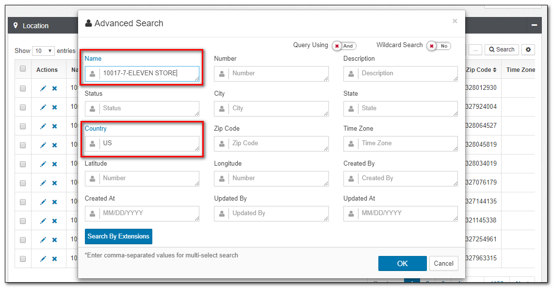
Figure 14. Include Data Using AND Query Option in Advanced Search
Searching using one attribute with include and one with exclude option and query using AND set to true
In the screenshot below, the attribute SKU is set to 1000001066-177234 with exclude option, and the attribute Product UPC is set to 1000001129 with include option and the query using AND set to true. The search would return all records with Product UPC matching 1000001129 and excluding the record with SKU set to 1000001066-177234.
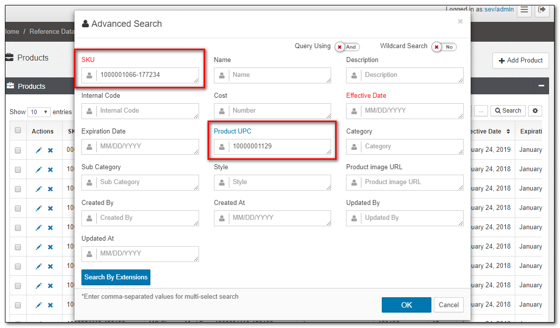
Figure 15. Include/Exclude Using AND Search Operation in Advanced Search
Using OR query option
When two or more attributes are used to search the reference data with the OR query option, the search result would perform a union on all the attributes used to search and returns a set of data that includes records which contain matching data from any of the attributes used to search.
Searching using two attributes with include and query using OR set to true
In the screenshot below, the attribute City is set to the Deltona, and the State is set to Arizona with include option and the query using OR set to true. The search would return all the records with City Deltona, and all the records with the State set to Arizona.
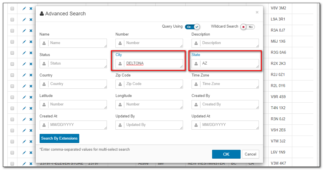
Figure 16. Include Data Using OR Query Option in Advanced Search
Searching using one attribute with include and one with exclude option and query using OR set to true
In the screenshot below, the attribute SKU is set to 00000000117418-280440 with include option, and the attribute Description is set to Star with exclude option and the query using OR set to true. The search would return all records with SKU matching 00000000117418-280440 and excluding the record with Description set to Star.
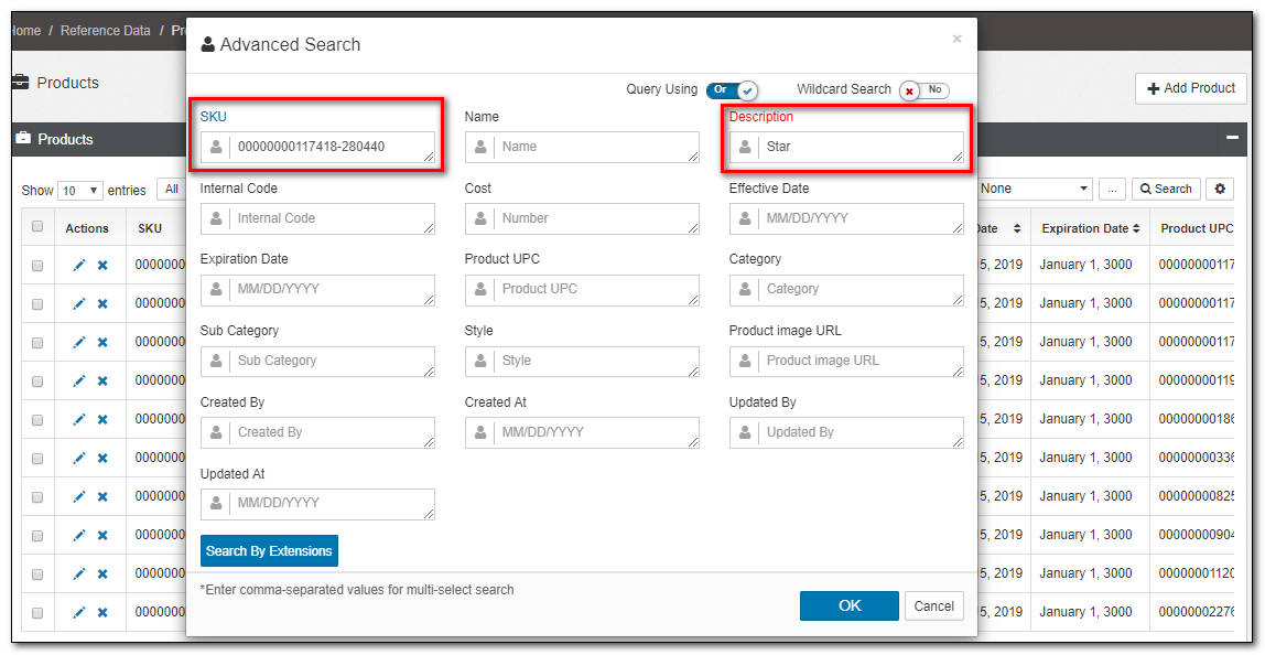
Figure 17. Include/Exclude Using OR Search Operation in Advanced Search
Creating Named List on reference data
Named Lists are custom filters created on all the reference data. It's a subset of the different types of reference data.
1.Search and filter the records by typing in your search criteria in the Advanced Search dialog box of the required reference data such as Segments, Locations, Products, and others.
2.Click ellipsis (...) provided on the top-right corner of the respective Reference Data window. The Named List dialog box appears as shown below:
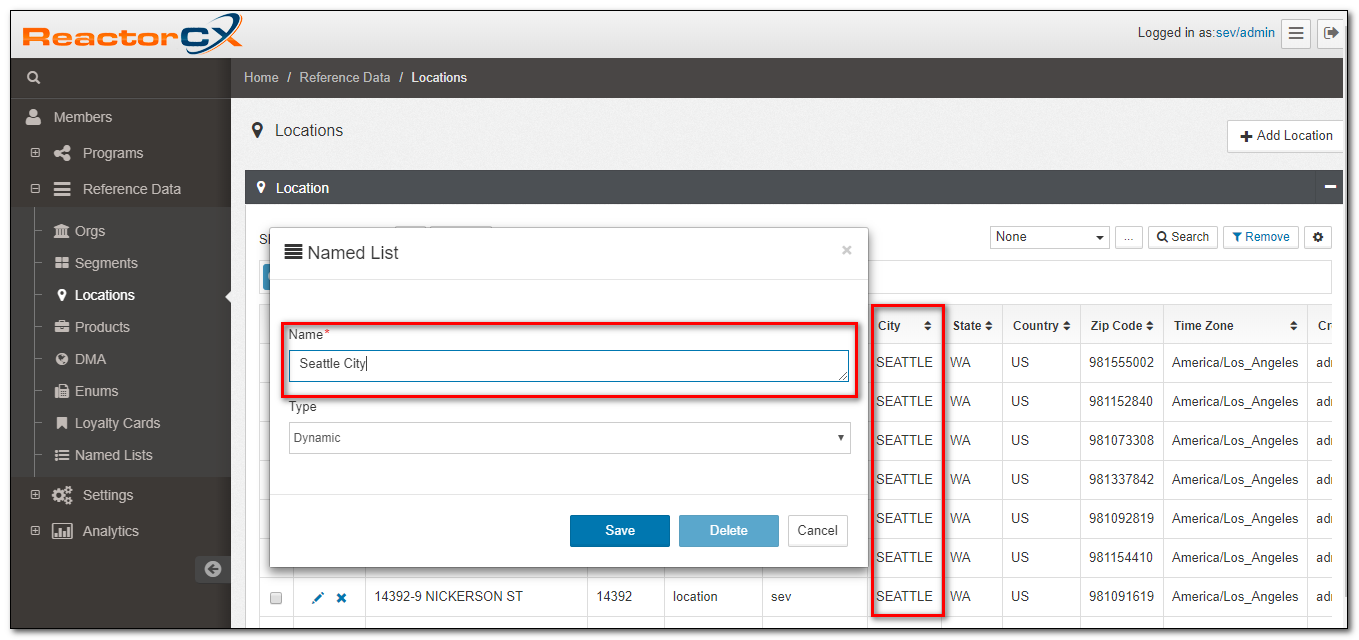
Figure 18. Named List
3.Enter the Name of the list to be created and select the Type either as "Dynamic" or "Static" from the drop-down menu.
4.Click Save , Delete or Cancel button to confirm, delete or discard your changes.
Example
In the Locations window shown in Figure 4, search criteria is City name which is Seattle.
Named List which is to be created is Seattle Region and the Type is selected as Dynamic.
For searching and filtering the Products data, follow the steps as mentioned below :
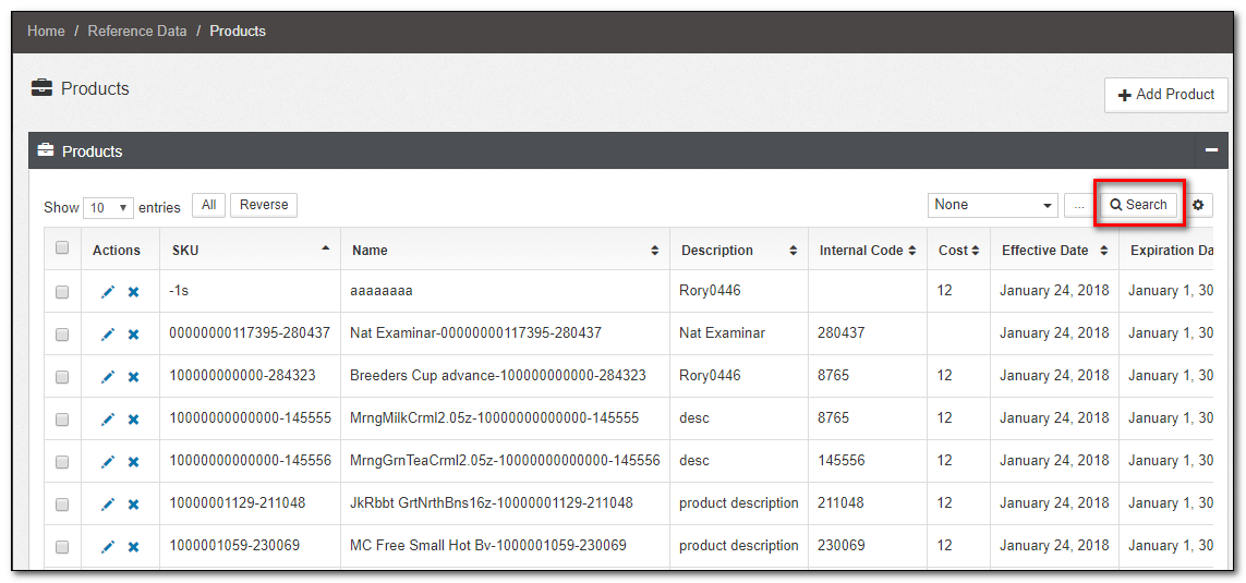
Figure 19. Products Window
2.Click the Search button provided in the top-right corner of the Products window. A new dialog box appears as shown below:
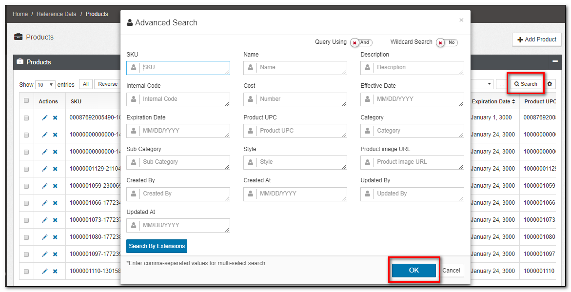
Figure 20. Products Advanced Search
3.Enter a search string or combination of characters that are required. The search string could be the data in any of the attributes in Products reference data. The most common attributes used to search include the following:
- SKU (Stock Keeping Unit)
- Name
- Internal Code
- Product UPC
- Category and Sub Category
- Description
- Cost, and others.
4.Click OK or Cancel to confirm or discard your changes.
Tip
For searching and filtering all other reference data such as Segments, Enums, Loyalty Cards, and others., follow the same procedure as illustrated above for Locations and Products.
Exporting Named List Reference Data as CSV
Use Export Data to export specific data elements from a Named List to a spreadsheet.
-
Navigate to Named Lists
Click the "Reference Data" menu item in the left-hand menu to access the Named Lists view. -
Select the Named List
Locate the Named List you wish to export.
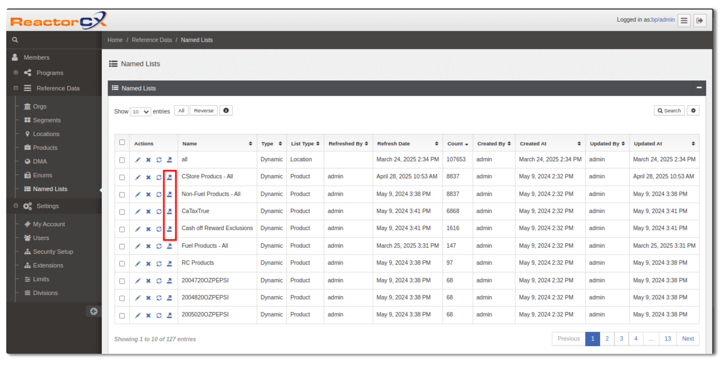
Figure 22. Named List Selection- After clicking the Export icon/button, a popup window titled 'Export Data: [Named List Name]' appears, allowing users to select specific fields for export.
-
Export the Named List Data
Click Export to initiate the export.
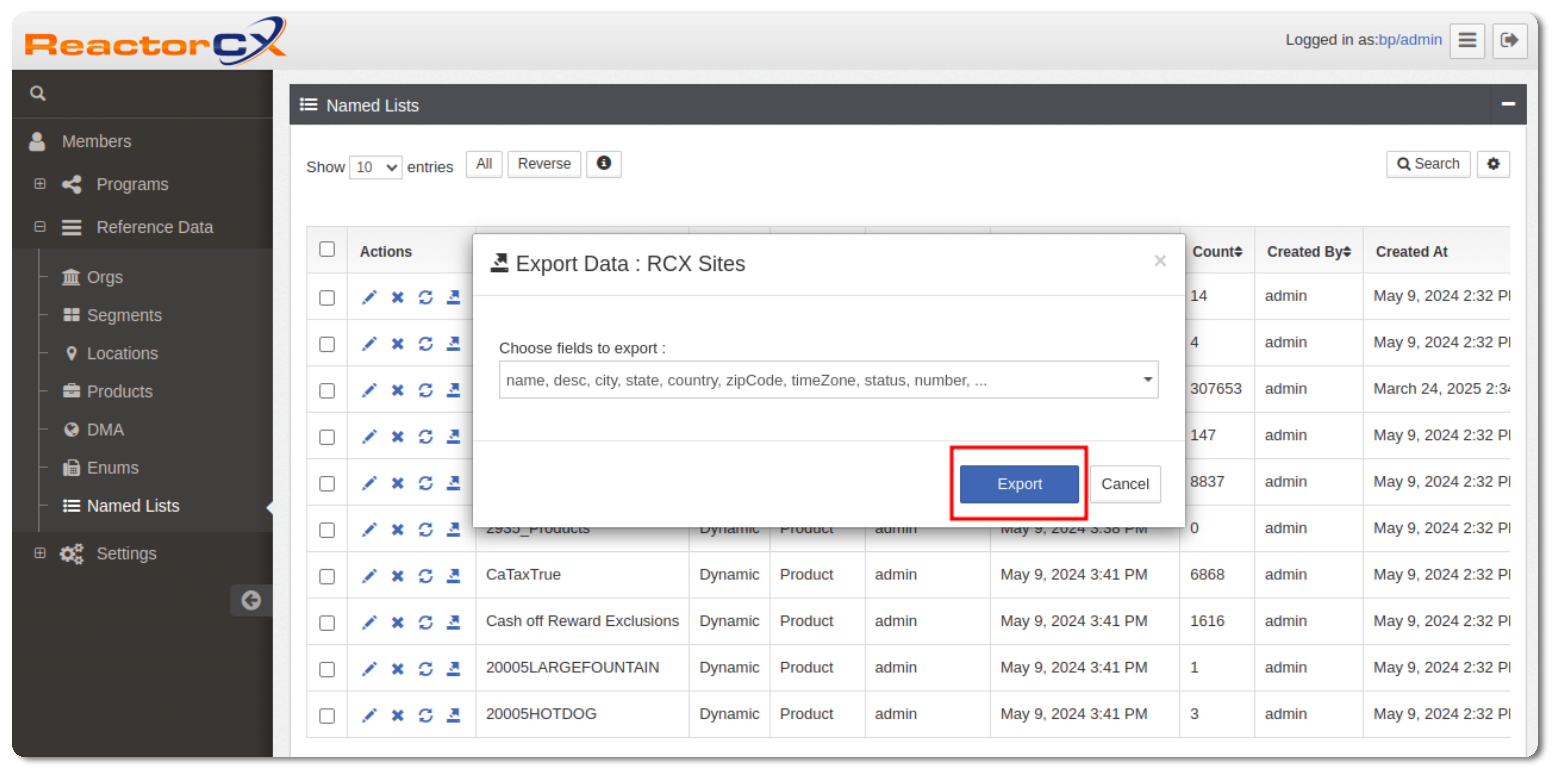
Figure 23. Export Data Popup -
Download the CSV File
The system will generate and download a CSV file containing the selected fields.Note
Files up to 80 MB are available for download.
Field Settings
In List Applets, you can choose the fields you want to display, and you can reorder the columns to your liking.
- To select which fields you want to see in the List Applet, use settings as shown in Figure 6 below.
- To reorder columns in the List Applet, click the column heading and drag the column where you want it to appear.
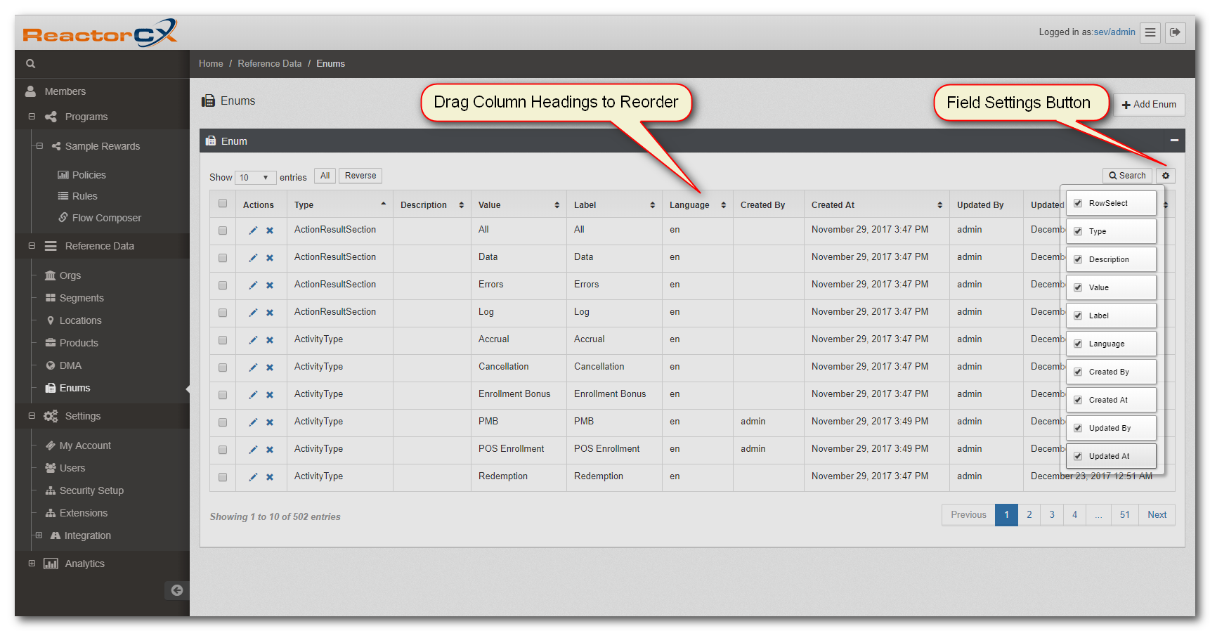
Figure 24. Field Settigns
List Pagination
When you are in the List Applet, you see only the first 10 records, with the rest paginated.
- To select a different page, use the page navigation buttons in the bottom right corner of the List Applet.
- To show more or fewer records per page, use the Show drop-down in the top left corner of the List Applet.
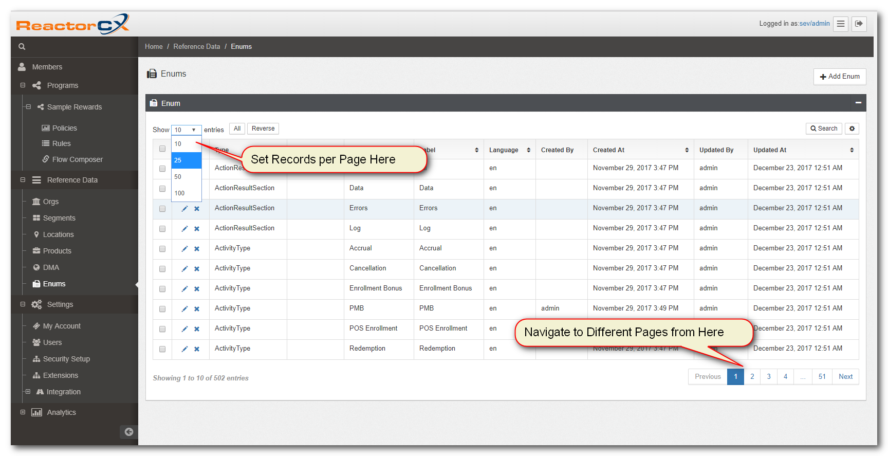
Figure 25. Pagination
Task-specific UI
The application includes some views in the application, such as Rule Editor and Expression Builder, which are described in detail within the Program Administration Guide. Additionally there are specific views designed for Extensibility and Permission Administration which are described in the System Administration Guide.
Extensions
The Extensions tab allows users to enhance existing schemas by adding custom extension fields. This feature provides flexibility, enabling users to include additional information as needed. Adding these fields is entirely optional and user-driven.
For each schema, there are two key sections: Schema Extensions and Model View Definition.
- The Schema Extensions section allows you to define an extension JSON, where you can specify additional field names along with their data types. The configuration follows the JSON Schema Draft-04 specification for syntax and data type validation.
- The Model View Definition section enables you to manage access control for extension fields.
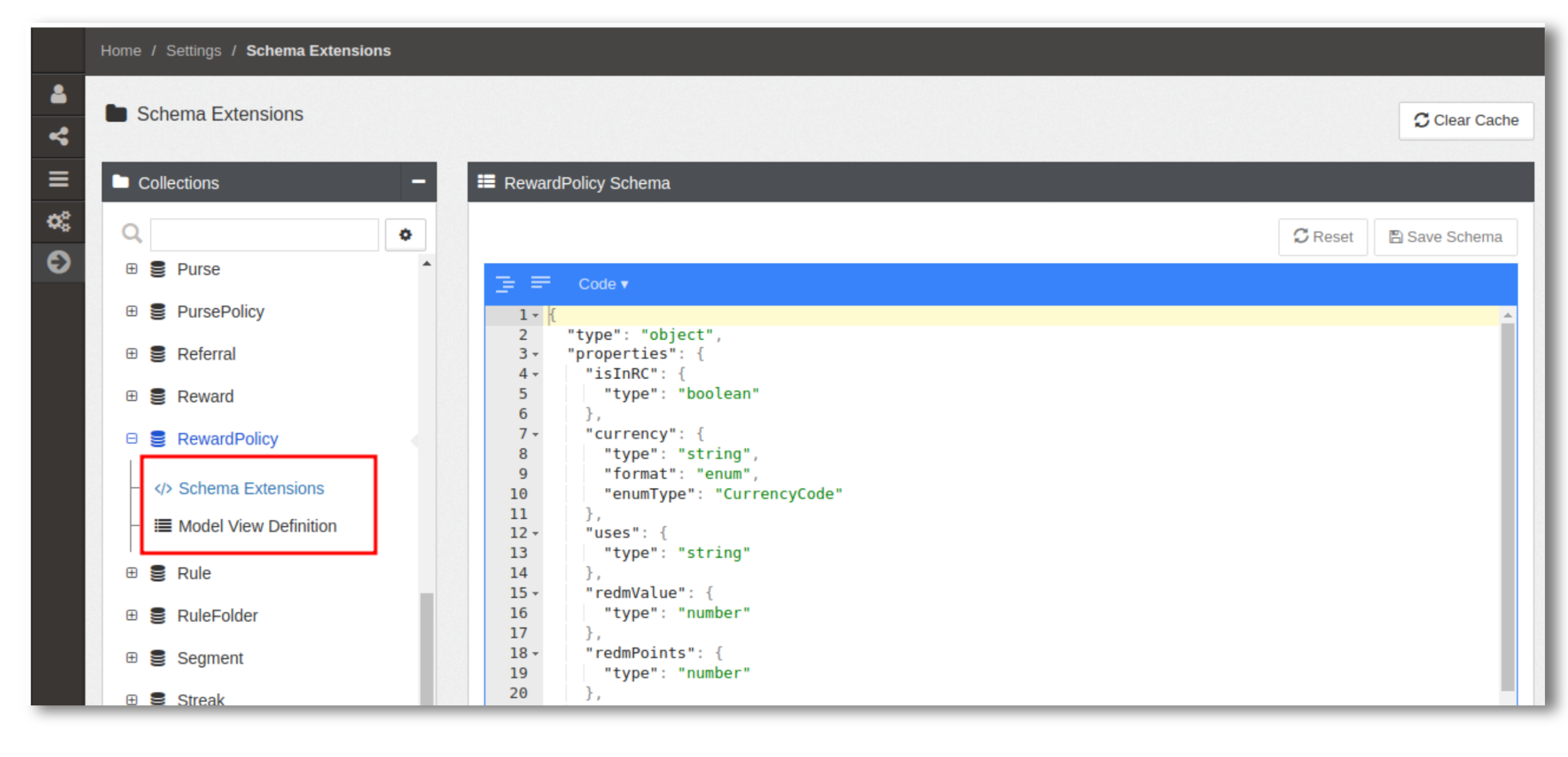
Figure 26. Extension-sections
Schema Extensions
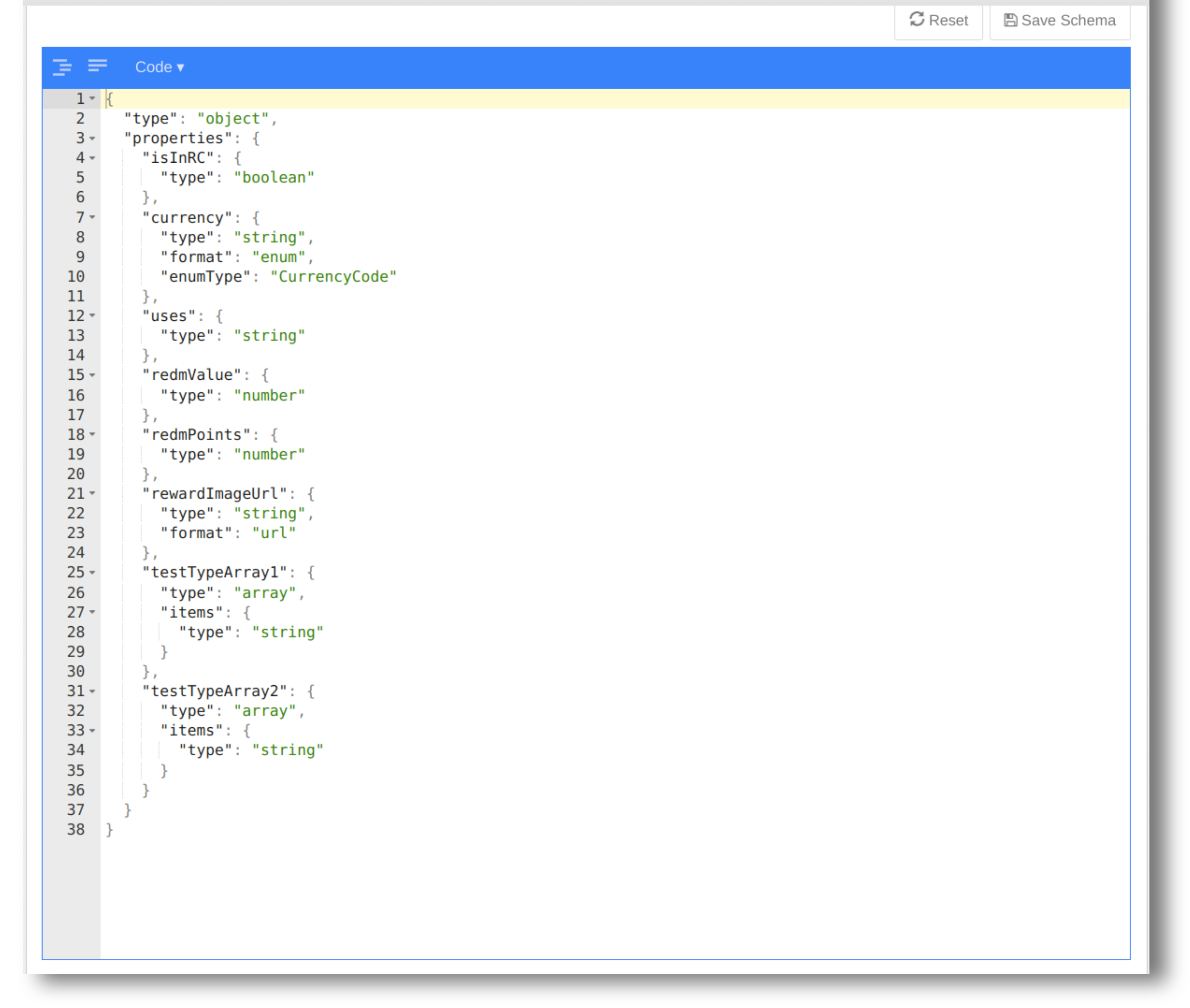
Figure 27. Schema-Extensions
Model View Definition
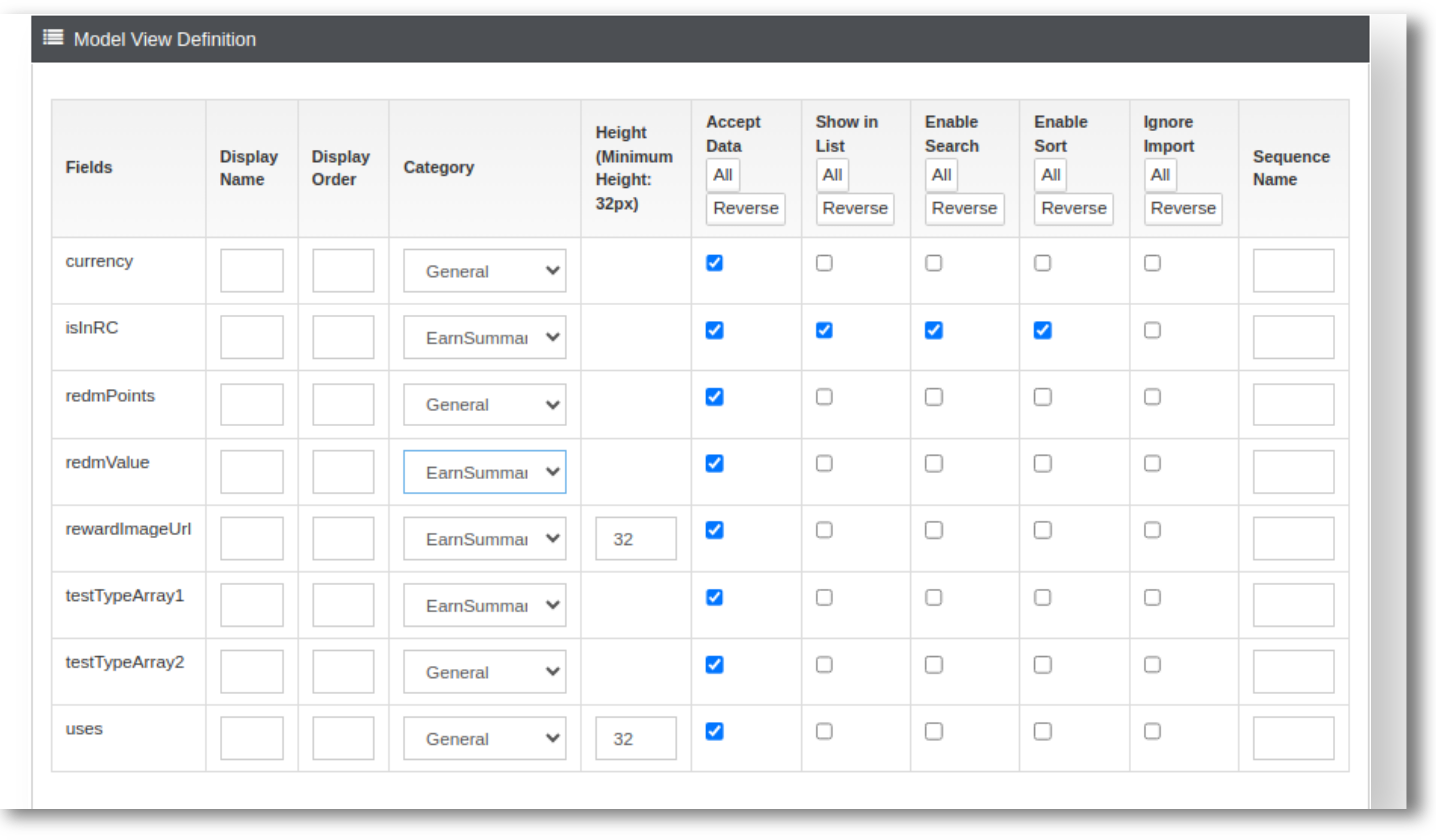
Figure 28. Model-View-Definition
- Display Name: The label shown in place of the original field name.
- Display Order: Determines the order in which fields appear in the Extended Attributes popup.
- Category: The name of the category under which the field is grouped.
-
Height: The field height is set to 32px by default, but can be adjusted in pixels based on a specified value. However, this adjustment is limited to string-type fields, with the exception of those in specific formats listed below.
datetimedate-timeiso-timeiso-date-timedurationenum
-
Accept Data: Allows data entry in the Extended Attributes popup.
- Show in List: Displays the field in the list view of saved records.
- Enable Search: Enables search functionality using this field.
- Enable Sort: Sort is performed using that field.
- Ignore Import: Excludes this field during the import process.
- Sequence Name: Automatically generates a counter value for the field.
To improve organization and ease of access, users can group extension fields into categories within the UI. Categories help present information and enable quicker navigation.
Categorizing Extension Fields:
- Users can create custom categories by clicking the "Add Category" button in the Extensions tab.
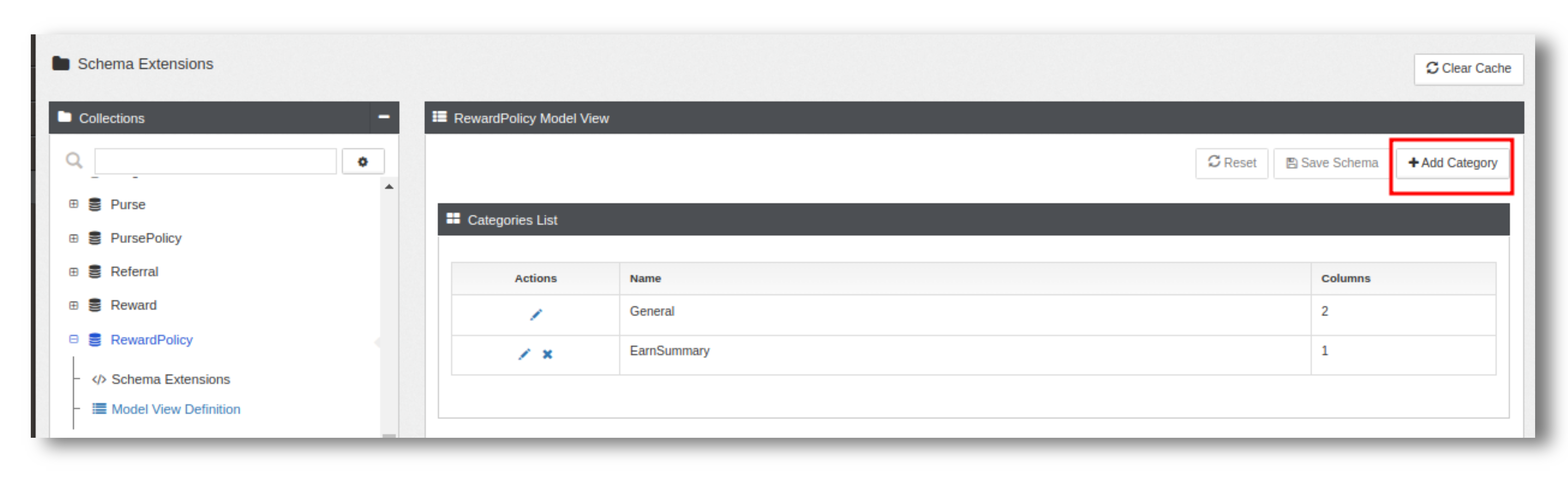
Figure 29. Extension-sections - In the Add Category popup, there are two input fields:
- Name: The category name (maximum 20 characters).
- Columns: Defines the layout of the category in the UI. The default value is 2, with a minimum of 1 and a maximum of 4.
- General is the default category for every extension and not allowed to delete General category.
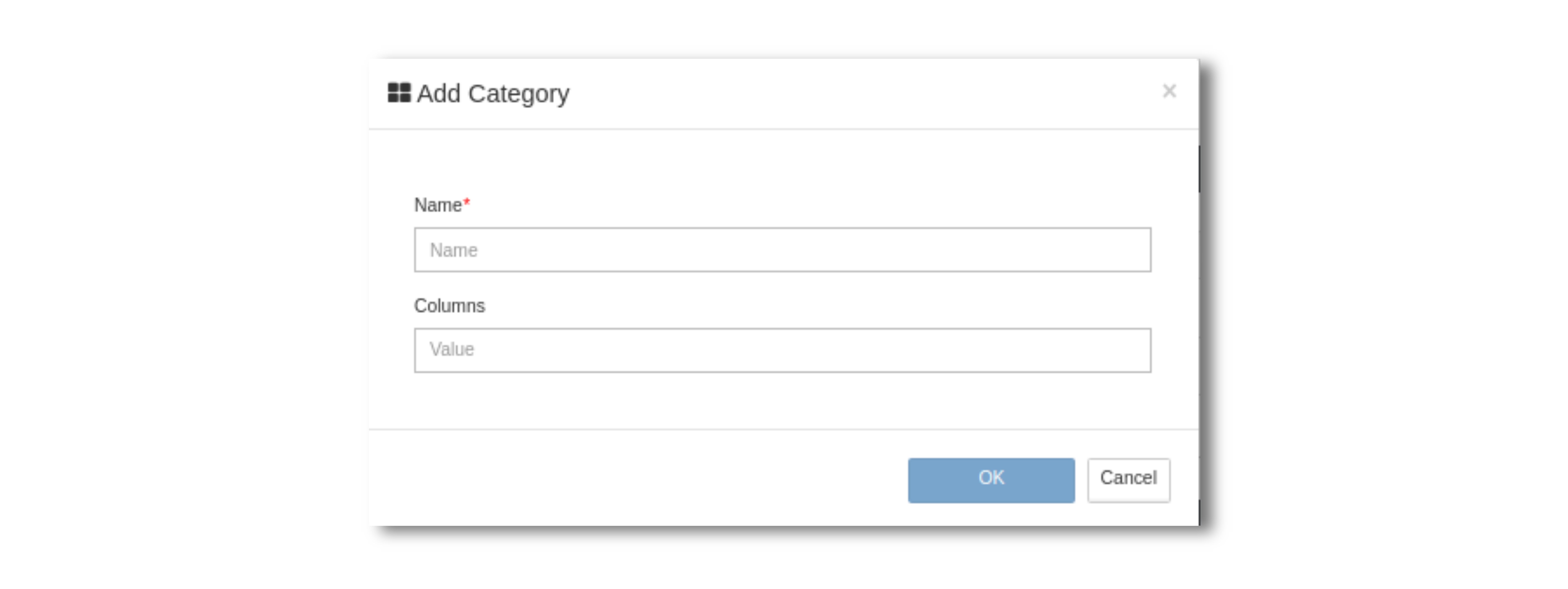
Figure 30. Add-Category
Extended Attributes
The Extended Attributes button is available at the UI schema level and provides access to all configured extended attributes. This button is visible only when extension data is present. If no category is selected,the button is disabled.
Next to the Extended Attributes button, you can find a Categories dropdown. This allows you to filter and view extended attributes for a specific category in the popup. The dropdown does not appear if only the default General category is available.
Categories dropdown only available for these schemas:
- Program
- Reward Policies
- Rules
- Streak Policies
- Goal Policies
- Purse Policies
- Tier Policies
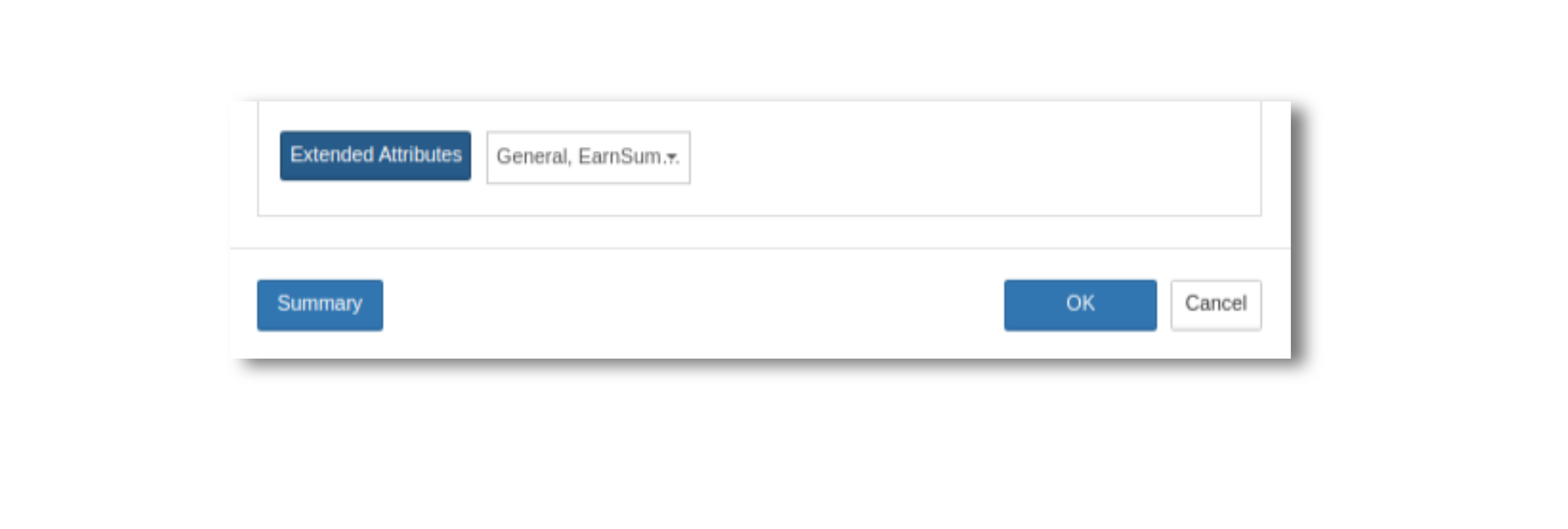
Figure 31. Extended-Attributes-Button
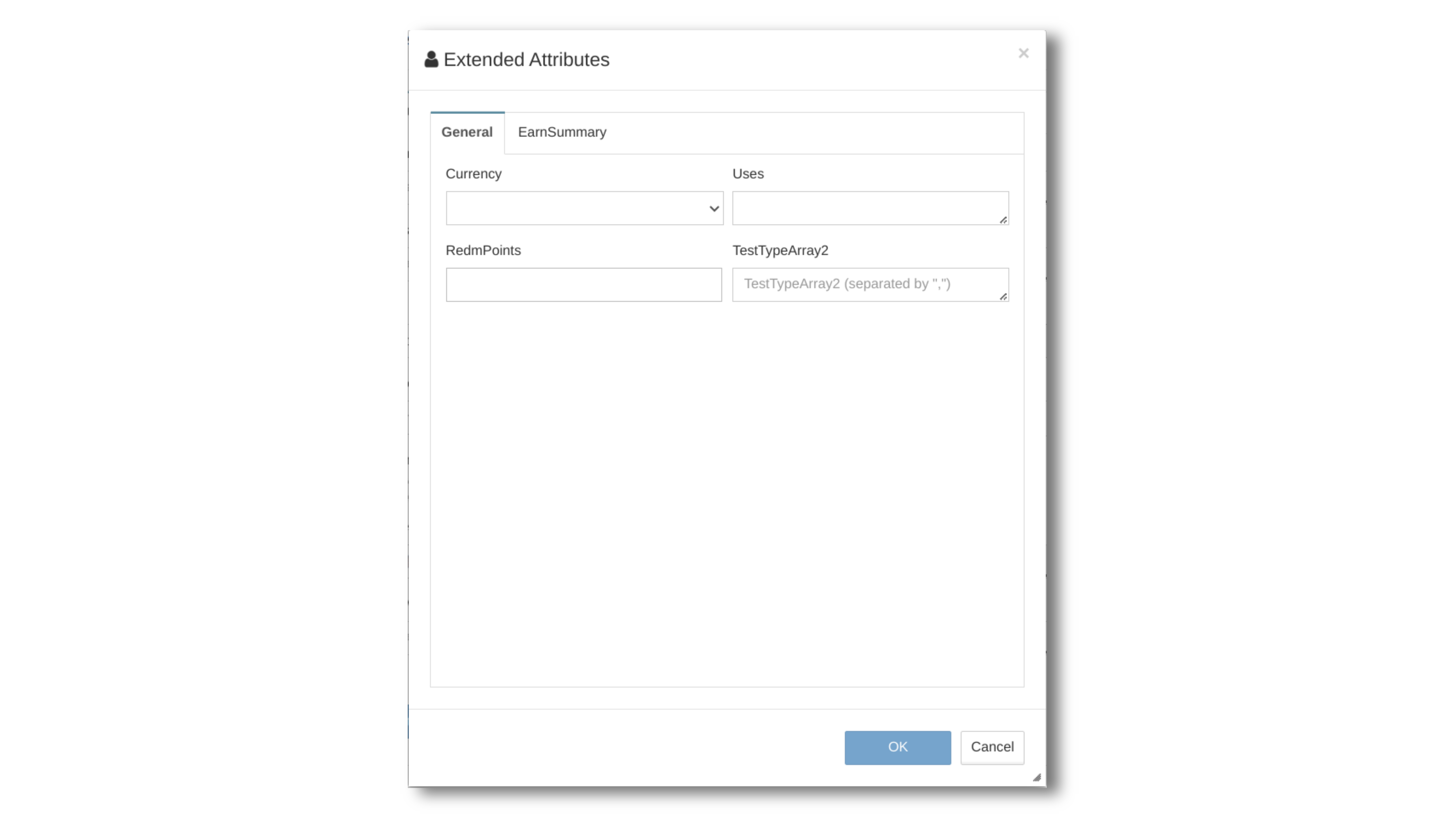
Figure 32. Extended-Attributes
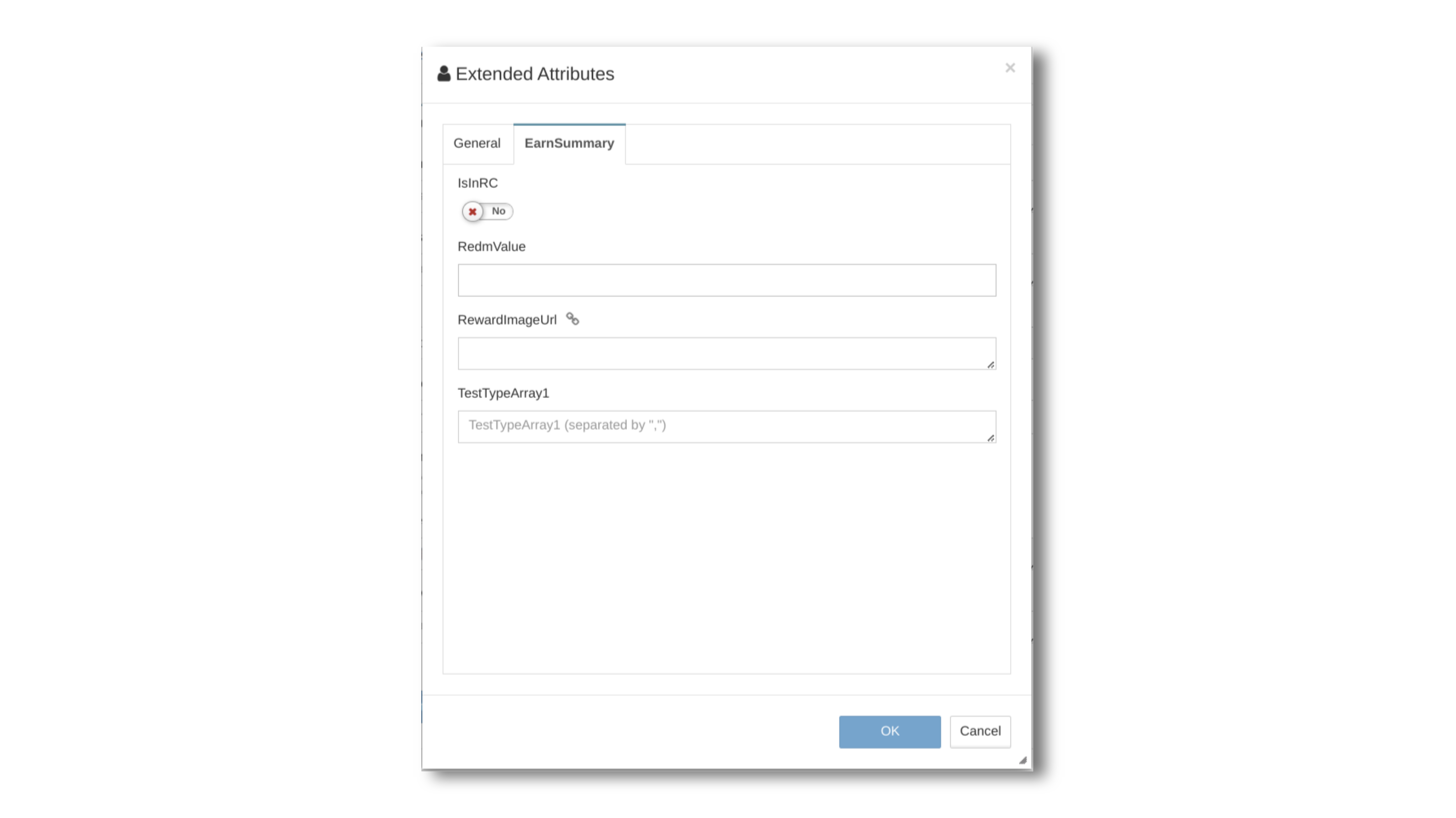
Figure 33. Extended-Attributes